Viewing a chart for the first time is generally both hypnotic and perplexing.
Price action, or ‘PA’, is a term employed to note the movement, or ‘action’, of price on a chart for a given market. A chart, for those new to trading, is simply a graphical representation of historical price movement over a selected timeframe – the time frame refers to a specified periodicity price action is displayed on a chart.
Technical analysis employs a selection of charts based on the information required.
Three frequently used charts are the line, bar and candlestick configurations:
- A line chart is the most basic chart used in finance, created by connecting a series of closing prices. Most trading platforms allow traders to specify timeframes.
- A bar chart, often labelled OHLC chart, employs the use of bars, representing the trading range of a security over a given time period. Offering additional information over its more basic counterpart: the line chart, a completed bar provides the open price (O), high price (H), low price (L) and the closing (C) price.
- A candlestick chart, similar to a bar chart, also offers information on the open (O), high (H), low (L) and closing (C) prices over a given time period. The difference between the two charts tends to fall on the thickness of the candle body.
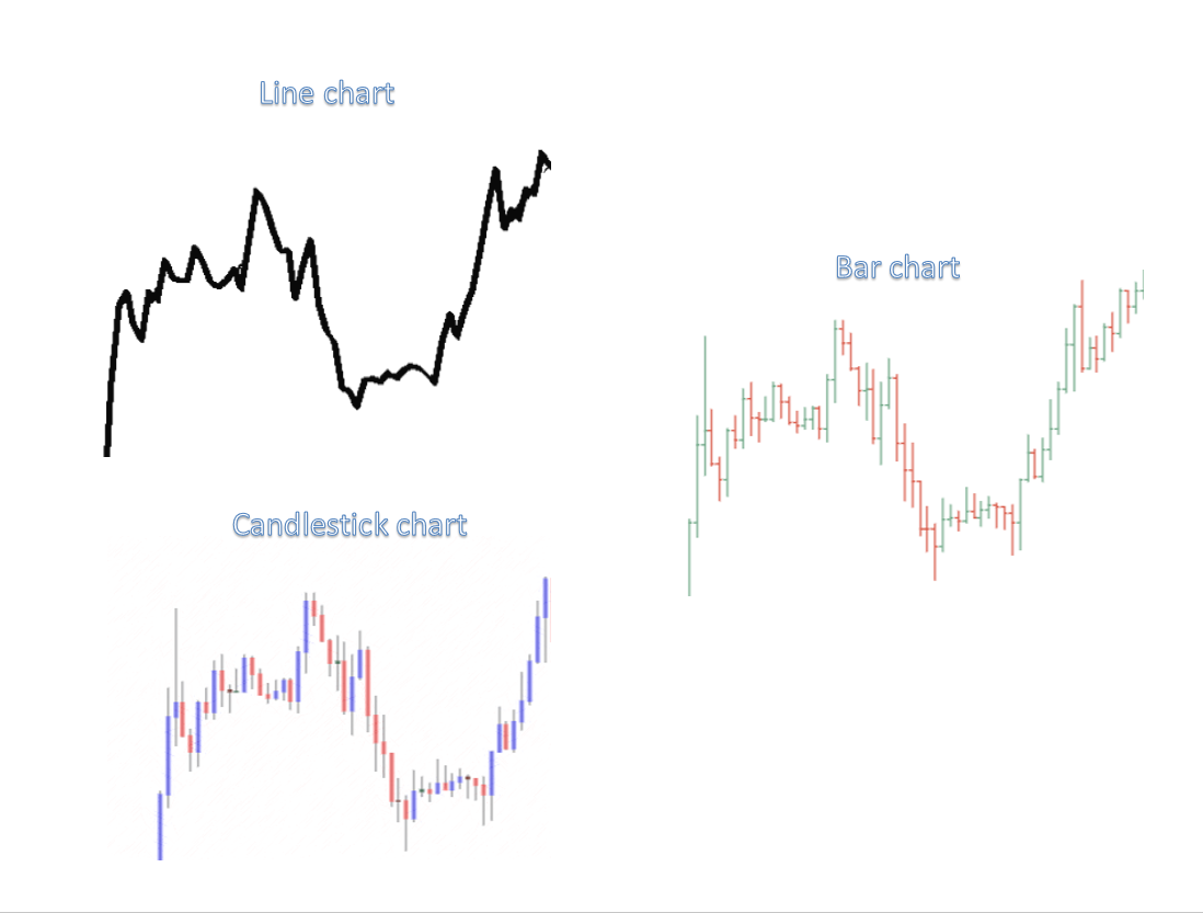
Charts represent a key characteristic of technical analysis. It is vital traders recognise what’s presented on a chart and the information it provides.
Compared to traditional bar charts, consensus indicates traders consider candlestick charts the more visually engaging/appealing and easier to interpret.
Candlestick anatomy
Knowing the framework of a candlestick is essential. Used extensively throughout the trading community, each candle delivers a valuable story.
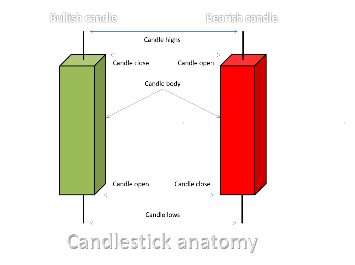
- The opening price is the point at the beginning of the candle creation.
- The closing price forms at candle completion.
- The highest price – also known as a candle’s wick – is seen at a candle’s high. It essentially demonstrates the highest price paid during the formation of the candle.
- The lowest price – known as the candle’s tail – is seen at the candle’s low. It signifies the lowest price paid over the candle’s life.
The central filled portion of a candlestick – that is between the candle open and the close – is known as the real body or candle body. Candlesticks generally implement a colour-coded system to signify direction, enabling traders to rapidly decipher whether price is rising or falling.
As shown above, a green body emphasises a bullish (buying) tone, whilst its red counterpart demonstrates a bearish (selling) presence. It might also be worth noting that the closing price has added significance as it determines overall buyer/seller conviction during the candle period. Generally speaking, the longer the body is, the more intense the buying or selling pressure.
Candlestick charts are thought to have been developed in the 18th century by Munehisa Homma, a Japanese rice trader of financial instruments. In December 1989, Steve Nison – known worldwide as the father of modern candlestick charting – wrote an introductory article on Japanese candlesticks. It turned out he was one of the few Americans familiar with this centuries-old Japanese technique. Since then, Japanese candlestick patterns have become a staple in many trading plans throughout the western world, including the widely popular pin-bar strategy.
Market structure
As the sea ebbs and flows along its shoreline, price action flows in a similar manner.
Market structure is your map to defining potential direction.
Below is a visual representation of basic market movement, composed of FOUR key swing points:
- HH – Higher high
- HL – Higher low
- LL – Lower low
- LH – Lower high
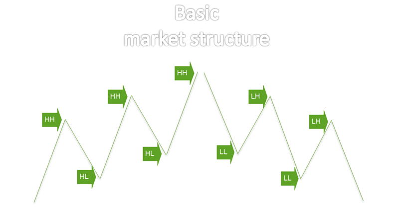
A rising market consists of a series of higher highs and higher lows, while a declining market is arranged via a run of lower highs and lower lows.
Should the market print a higher high, the expectation is, therefore, for a higher low to form, followed by a subsequent higher high. This is a market uptrend.
The same is said for a lower low. The expectation from here is for a lower high to take shape, attended by a subsequent lower low. This is a market downtrend.
On a live chart, however, things are more complex. Between the main swing points, minor swings are also visible. For that reason, newer traders are urged to minimise their charts in order to focus the spotlight on only the main swings as depicted below:
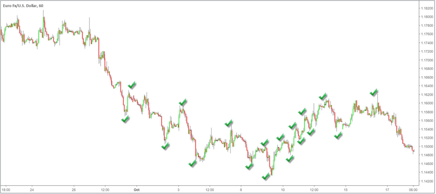
Being able to identify swing highs/lows helps traders interpret potential market direction. Furthermore, it is also a foundation for some of the more complicated chart patterns widely used in the technical domain.
Do yourself an enormous favour and train your eyes to recognize these extreme points, as it will benefit you later in your trading career.
Clean charts
Littering the charts with trading indicators (calculations based on a financial instrument’s price action) in the hope of unlocking the Holy Grail appears the norm nowadays, particularly for folks just entering the trading field.
The attraction is obvious. Place 3-5 technical indicators over a price chart and trade converging signals. If only it were that easy!
Below are two charts demonstrating the stark contrast between a clean chart based on raw price action vs. one with a number of moving averages and three technical indicators attached: the Relative Strength Index (RSI), the Stochastics Oscillator and the Average True Range (ATR):
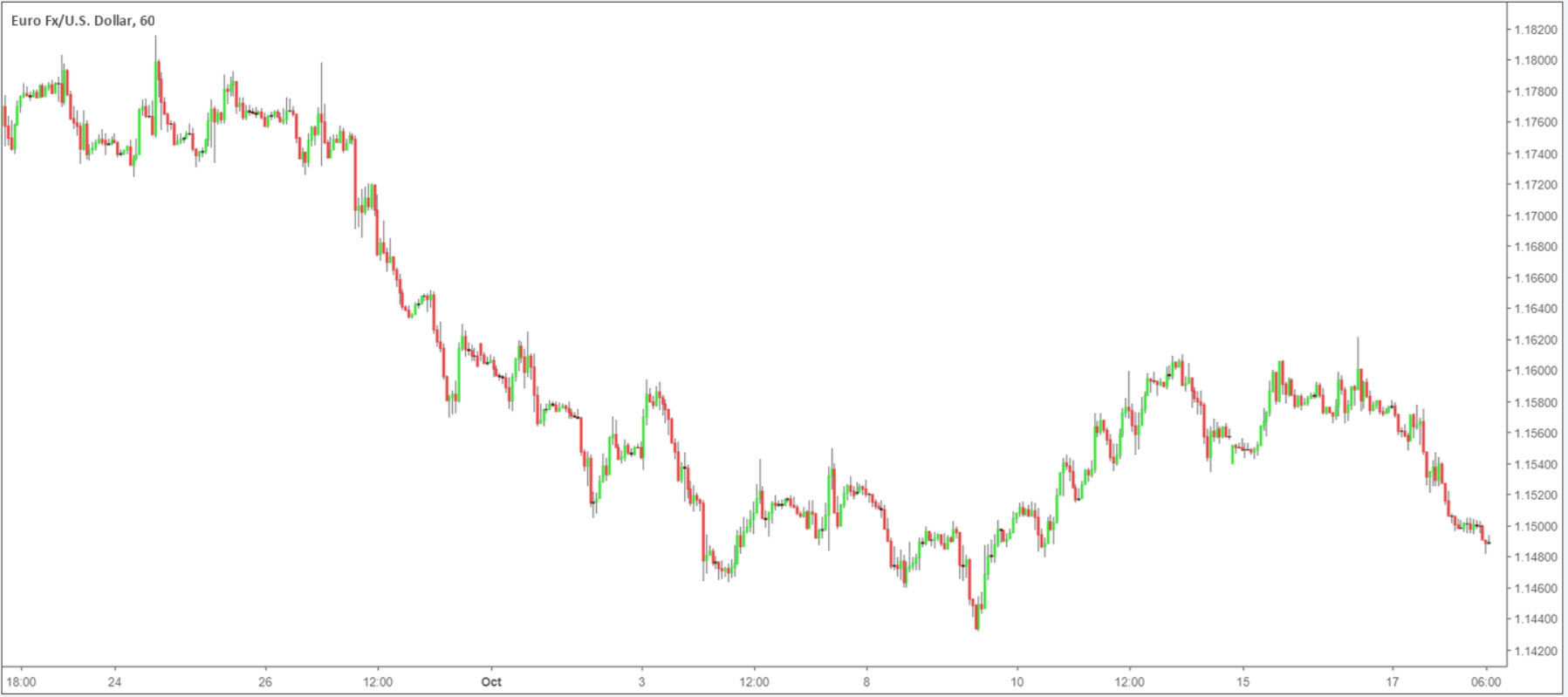
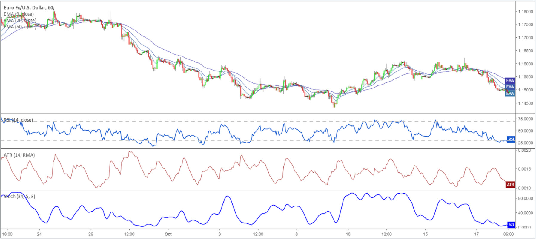
To accommodate space for the indicators, the price chart is actually minimised thus drawing attention away from price action towards the indicators.
The above is not to say trading indicators haven’t a place, as they do. The difference, however, is an experienced trader avoids overloading charts with indicators. They may have one glued to the bottom of the screen for confirmation purposes, though it’s rare to see many more than this.
Support and resistance
Understanding how to plot support and resistance lines on a price chart is crucial for technicians.
The concept of support and resistance essentially forms the basis for technical analysis in the financial markets.
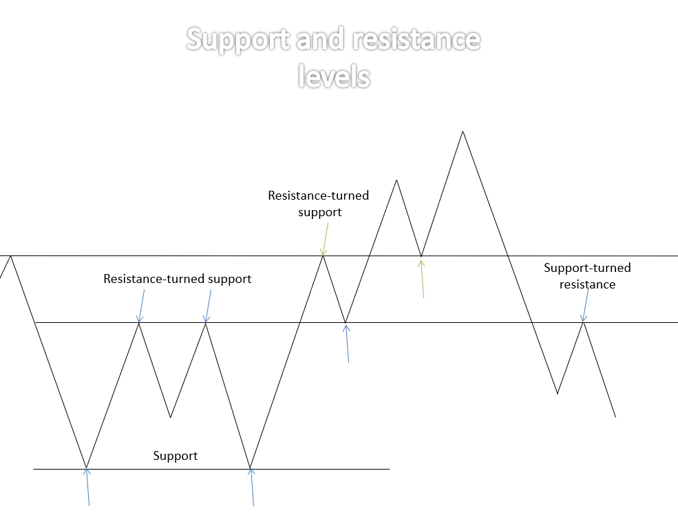
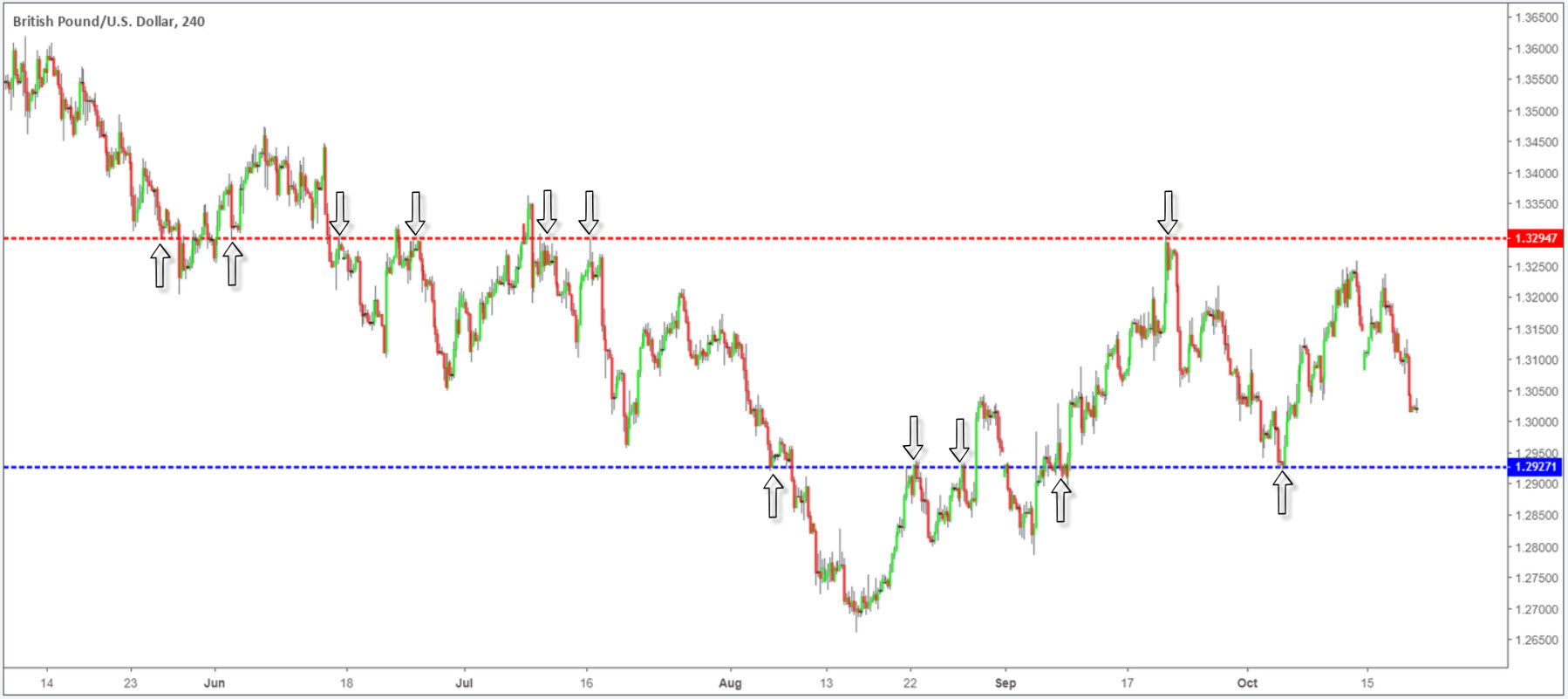
A support level, as the name implies, is considered the ‘floor’ in a market. Put simply, it is a point buying overcame selling. Technicians employ such levels to search for buying opportunities. Once the market engulfs the support, price tends to head lower until greeted by its next key level of support.
A resistance level is the opposite of support and signifies a ‘ceiling’ – a point selling overcame buying and a location technicians look for possible selling opportunities. Similar to support dynamics, once the market engulfs the resistance, price action tends to head higher until shaking hands with its next key level of resistance.
Traders may also want to acknowledge once support is taken out, it tends to act as resistance once retested. The same is said for engulfed resistances typically acting as support on return.
Trend lines
Unlike support and resistance levels, trend lines take shape at an angle. They are easy to understand and are often used in combination with other technical tools.
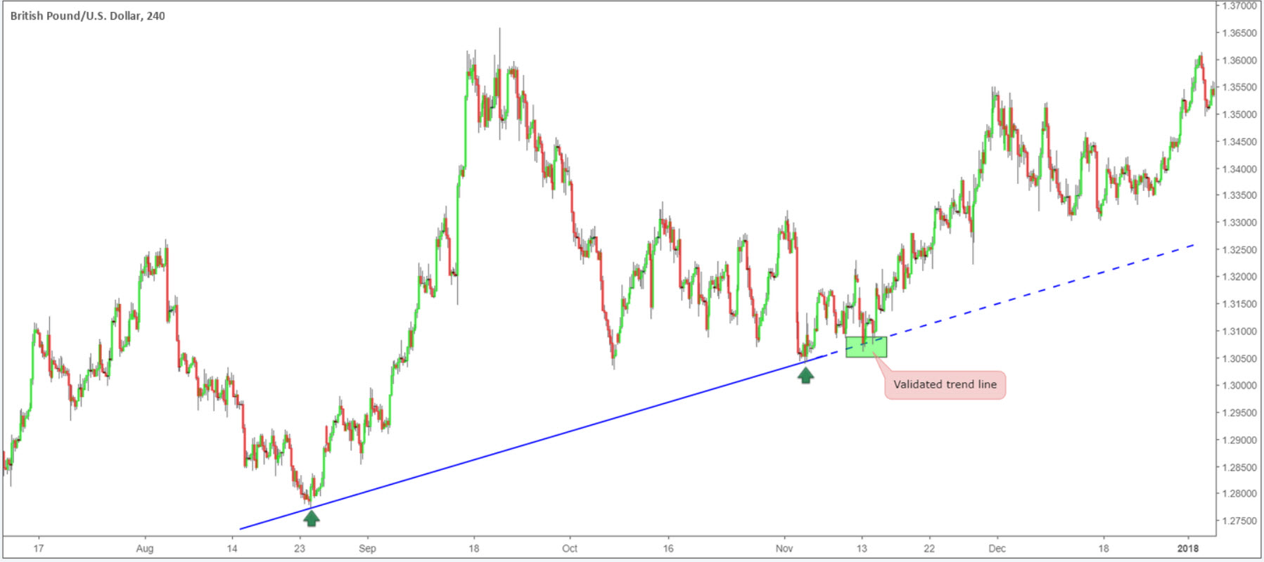
An ascending trend line has a rising angle. As long as price remains above the barrier, the market is generally in a trending phase: an uptrend.
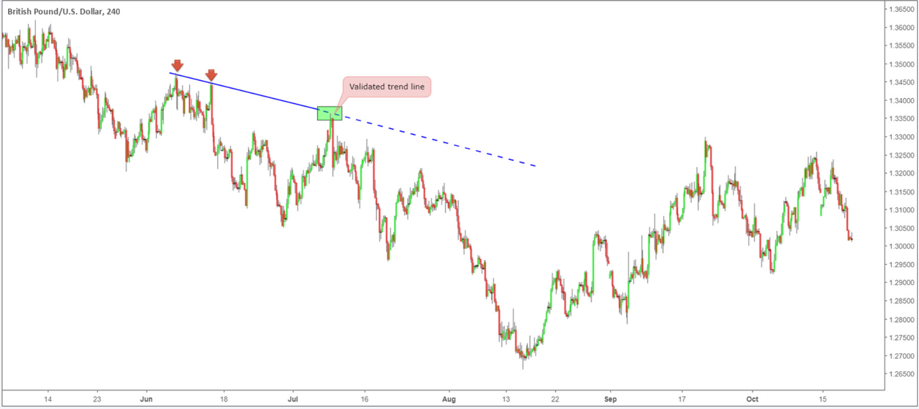
A descending trend line has a declining angle. Similar to the ascending trend line, only inverse, price is typically trending south (a downtrend) as long as the unit remains positioned beneath its limit.
Aside from trend identification, these lines offer pivotal support/resistance barriers to trade from.
At least two/three subsequent swing points are desirable before a trend line is tradable. Obviously, the more times a line is respected, the more valid it becomes.
Also, to avoid confusion, traders are urged to use ‘extreme’ highs/lows as the anchor point. An extreme is a point price aggressively rallied/declined from and consumed several highs/lows. The first chart is a picture-perfect example of this.
Supply and demand
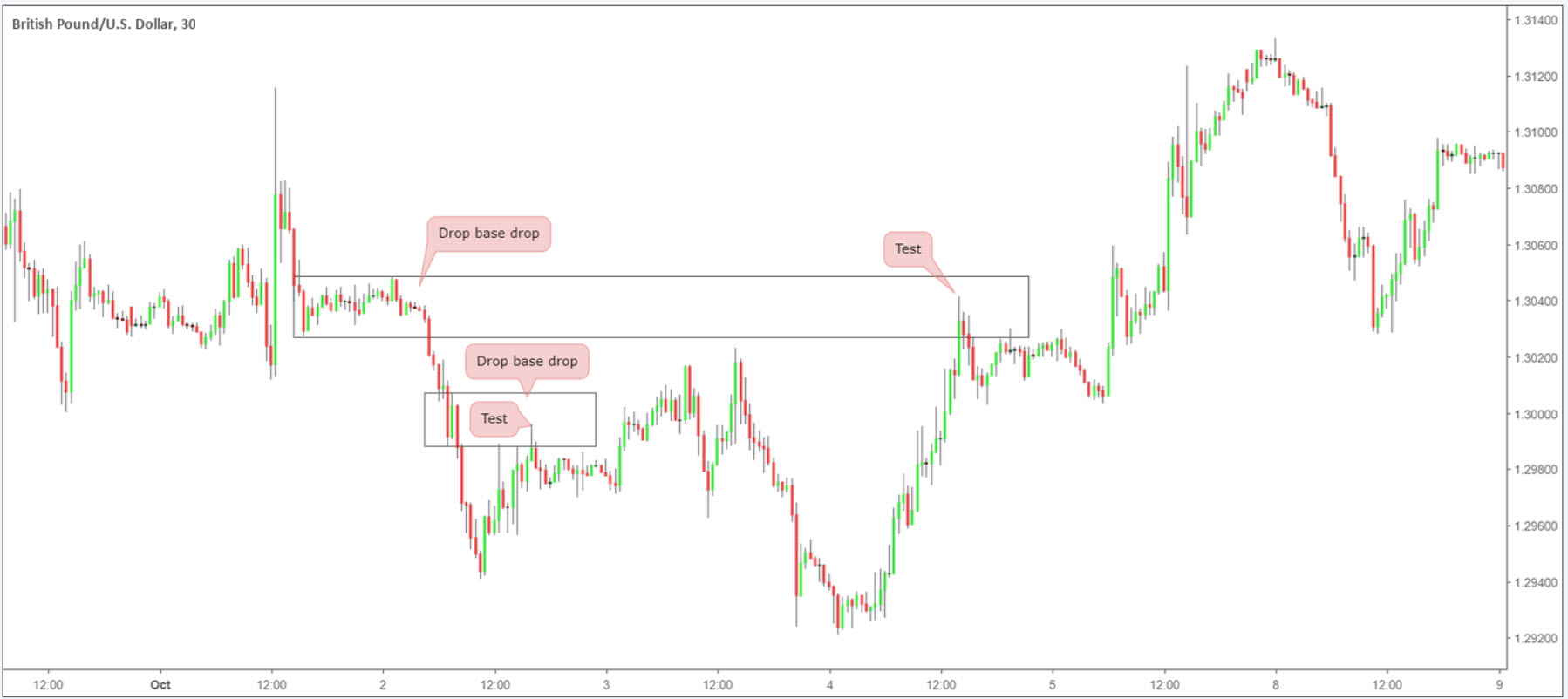
The general idea behind the widely popular supply and demand methodology is to locate points on the chart price produced a strong advance or decline. Following this, a retest of the origin is normally tradable.
A demand zone is typically formed after a strong rally north, whereas a supply zone forms following a noticeable move to the downside.
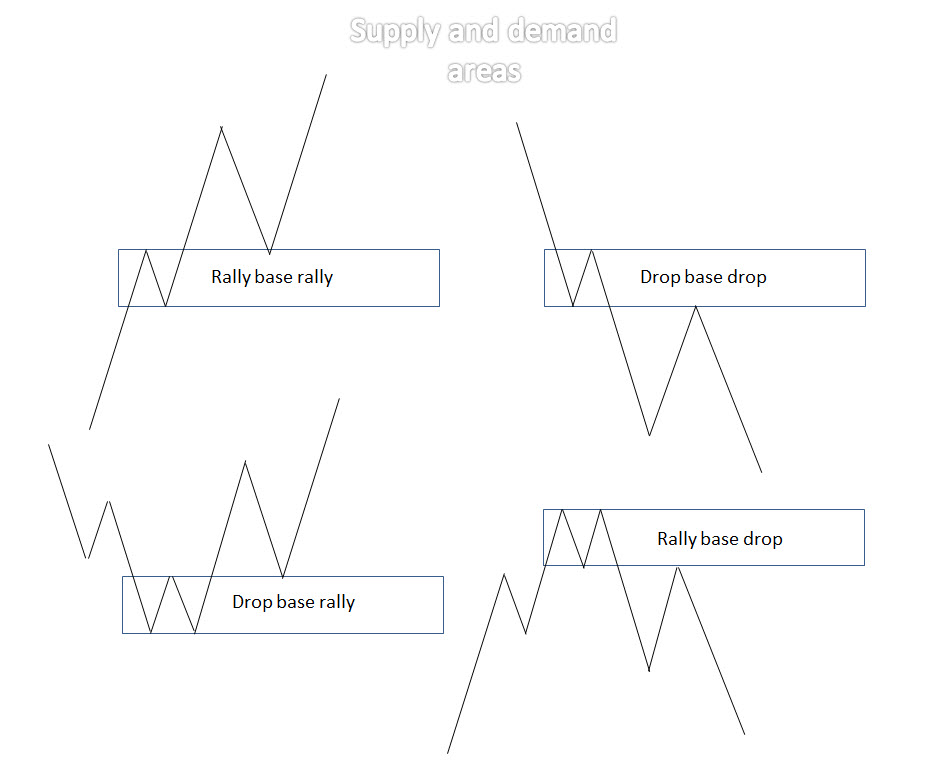
There are four key areas of supply and demand:
- A rally base rally (RBR) demand primarily forms within an uptrend. Effective at bouncing price for longs (a buy), especially on the initial retest, the area’s formation begins with an advance north, followed by a base and then a subsequent advance.
- A drop base drop (DBD) supply zone is, for all intents and purposes, the same formation as a ‘RBR’ area, though takes shape within a downtrend. Formed by way of a drop in price, followed by a basing process that’s shadowed with a subsequent decline. Typically, this is a stable zone for traders looking to sell (short) a market, particularly on its first time back.
- A drop base rally (DBR) demand is a zone that denotes a bottoming process. An effective area to buy from takes shape after a drop in price is observed, succeeded by a base and then a rotation to the upside.
- A rally base drop (RBD) supply forms in the same manner as the ‘DBR’ formation, only inverse, and is widely considered a stable platform to sell. The pattern forms a topping process after a period of buying, attended by a rotation to the downside.
Price action trading
Till now, the piece has briefly touched on the following concepts:
- Three commonly used charts.
- Basic candlestick anatomy.
- Market structure.
- Price action structures.
An understanding of these four points offers a rigid underpinning to approach more advanced price action structures.
As you’ll soon discover, though, an overwhelming number of price action trading strategies and trading courses are available to retail traders. This is the point it tends to become frustrating, particularly for the newer trader.
A topic worth underlining at this point is to try to avoid hopping from one strategy to the next. Once a methodology is chosen, spend at least three months testing its validity before disposing of it and moving on. Without giving the attention a strategy requires, how can a trader possibly know if it truly works?
Another issue worth emphasizing is to keep it simple. Like most things in life, complicated can always be simplified. Using supply and demand areas along with trend line convergence and trend direction is sufficient enough for some traders to profit. Using this simple approach, traders are able to pin down several trading opportunities each month, with some offering incredibly profitable moves.
Why not consider beginning your price action journey opening an ICMarket’s demo account: https://www.icmarkets.com/en/open-trading-account/demo/. It’s free to open, you can practice until you’re ready to go live and it supports all account types, platforms and products.
IC Markets mission is to create the best and most transparent trading environment for retail and institutional clients alike, allowing traders to focus more on their trading. Built by traders for traders, IC Markets is dedicated to offering superior spreads, execution and service.


